
A History of Poverty Worldwide
How poverty reduction accelerated in recent decades


Much has been written about the huge gains in global poverty reduction in recent decades. There is broad agreement that this has been one of the great success stories in the history of international economic development, and scholars have rightly sought to determine how and why this success story occurred. However, an examination of surprisingly few factors greatly narrows our search for explanations.
Consider that in 1800, by a $1.90 per day standard, 81 percent of people worldwide were in poverty. One-hundred-ninety years later, only 44 percent were in poverty — a reduction of less than one-fifth of a percentage point per year. By contrast, in the 28 years since 1990, the rate of $1.90 per day poverty fell by more than 1.2 percentage points per year to less than 10 percent.
Putting aside any question as to the validity or general usefulness of this particular definition of poverty, in recent decades the world has by this measure progressed considerably. Bloomberg columnist Noah Smith described this decline as “incredible — nothing short of a miracle.” But scratch beneath the surface and we find the far more mundane fact that China and India had grown to the point they they happened to have accumulated large numbers of poor people just below the poverty line. Consequently, modest growth in these two countries alone would have sufficed to lift a great number of the world’s poor out of poverty.
How did these countries accomplish this? Insofar as rapid poverty reduction resulted from faster growth in China, it is fair to say that following the neoliberal Washington Consensus was not a significant factor. As with most Asian success stories of the twentieth century, the Chinese government played a central role in managing the economy. True, China has opened up to foreign investment; but it has done so with strong capital controls and foreign exchange management, imposition of myriad demands on would-be investors including significant transfer of technology, and lax enforcement of foreigners’ so-called intellectual property rights. Nor can China’s acceleration be attributed to neoliberal policy in the United States — see the negative economic experiences that most Latin American countries have seen with their increased exposure to the United States economy has had. Mexico, for example, had a higher poverty rate, and stagnant wages, after 20 years of NAFTA.
Below, we take a closer look at the history of poverty worldwide and establish that the acceleration of poverty reduction coincided with the establishment of a critical condition for such rapid improvement: the existence of a large number of poor people that happened to be just below the poverty line. The sudden drop in global poverty was due at least as much to happenstance of timing as it was to rapid income growth.
Thus, the policy question that emerges is the same question that has dominated for decades: what has China — and later India — done to develop so successfully?
Here we see the share of worldwide population which is in poverty — defined as household income of no more than $1.90 per day — as implied by the populations, per-capita household incomes, and Gini coefficients of inequality from the Swedish foundation Gapminder.[1]
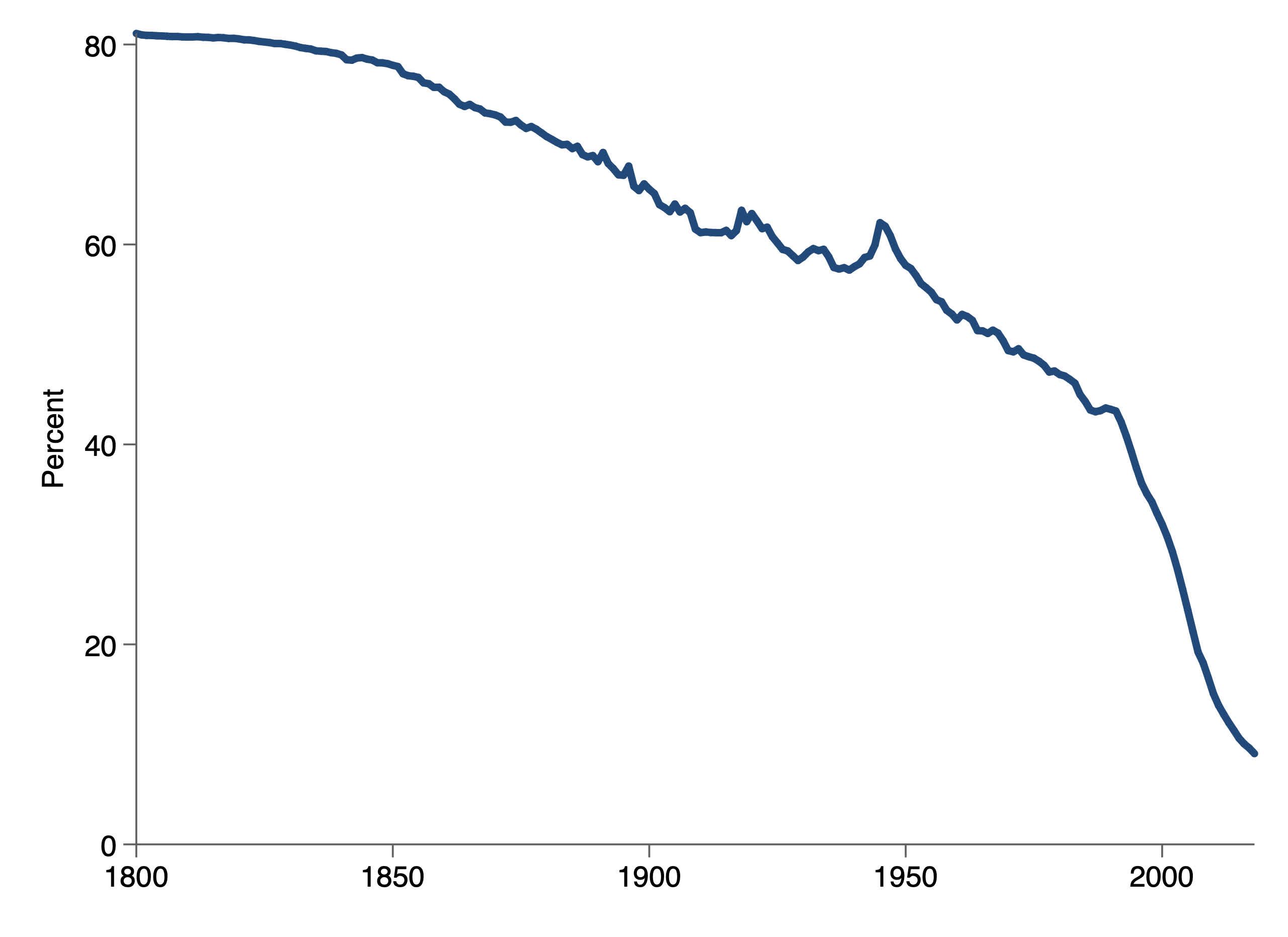
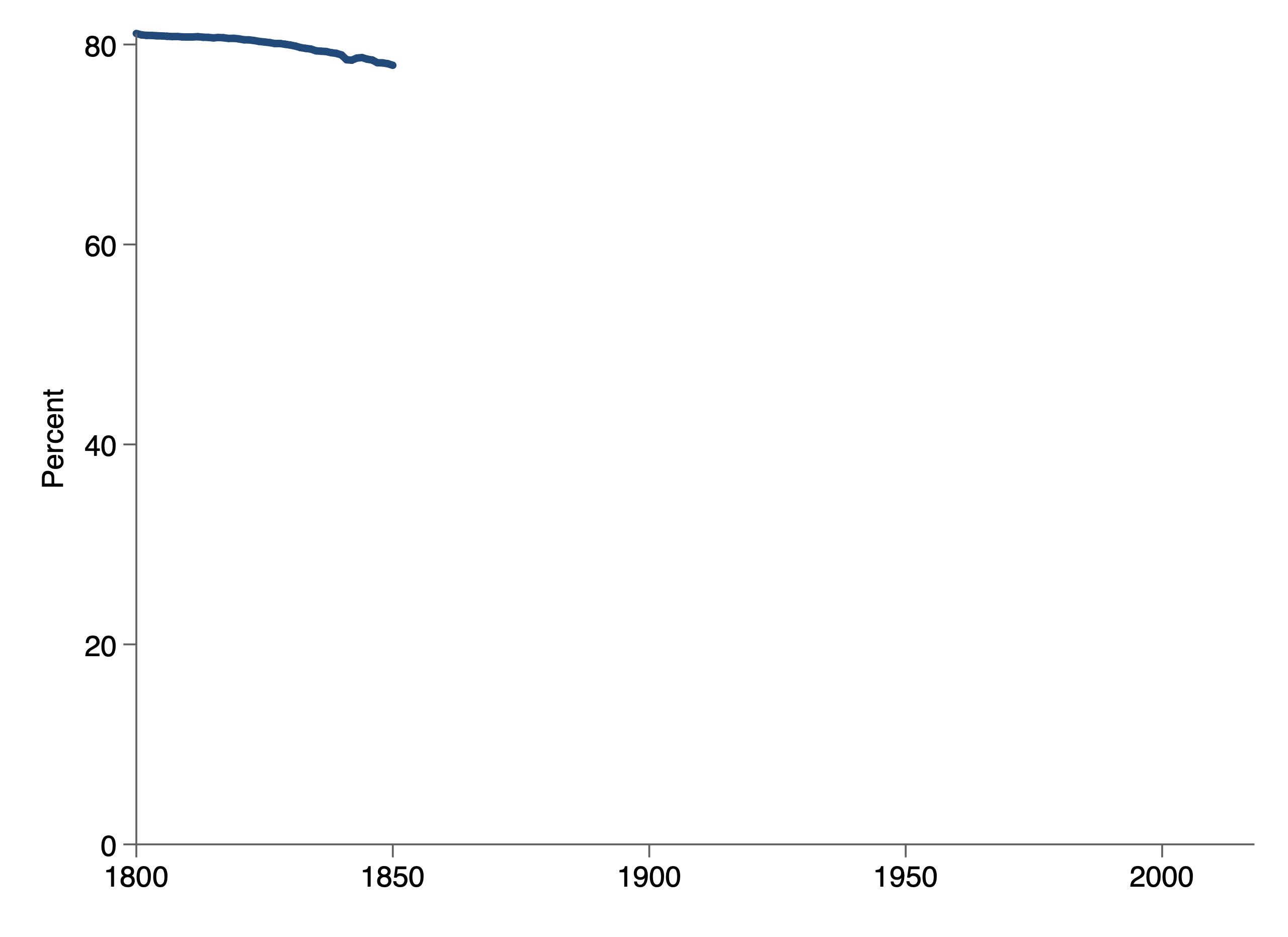
For the first half of the nineteenth century, progress in poverty reduction was relatively slow. Over those 50 years, this poverty rate fell three percentage points or less than one percentage point every 15 years.
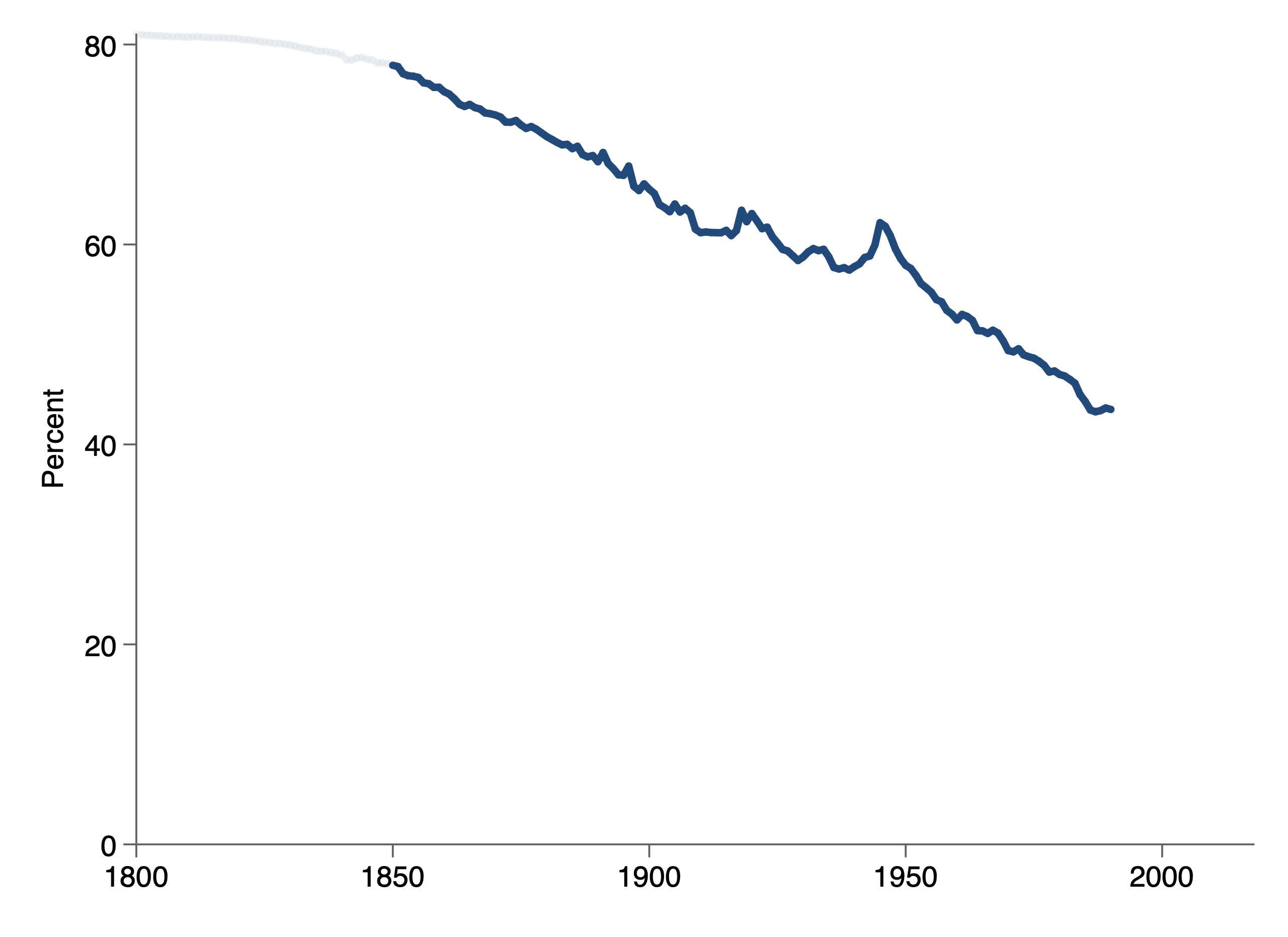
Then, from 1850 to 1990, progress was reasonably steady but for the periods of world war, falling more than 34 percentage points — or about one percentage point every four years.
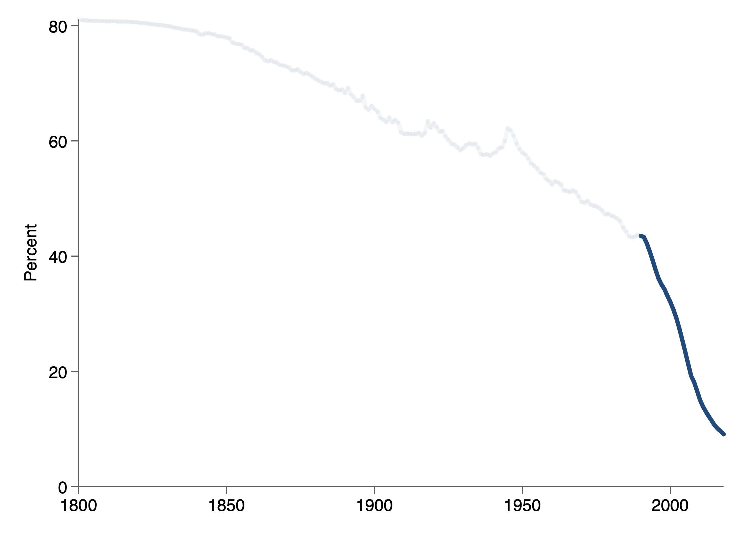
Finally, poverty has fallen more rapidly in the last 25–30 years. Going forward, a fall of more than a percentage point every year is clearly not sustainable. The poverty rate cannot drop below zero, and the last few percentage points of poverty will surely take much longer to eliminate.
[1]Thanks to Michael Höhle for providing data links in this exercise in reconstruction.

The connection between economic growth and poverty reduction is not straightforward. For example, rural China’s per-capita household income grew 6.2 percent per year from 1977 to 1987. Despite this impressive growth, the poverty rate (defined here with the $1.90 per day threshold) fell only by about 5 percentage points. By contrast, the poverty rate fell 50 percentage points — ten times as quickly — between 1991 and 2001.
Similarly, when the per-capita household income of rural Indonesia grew 6.3 percent per year between 1967 and 1977, the poverty rate dropped a little less than 15 percentage points; but it fell almost 36 points between 1986 and 1996 with only 5.6 percent annual growth.
In China’s case, some of the more rapid decline in the poverty rate was due to faster growth in mean household income — 8.7 percent per year, compared to 6.2 percent in the earlier period. And despite this growth slowing a bit (to 7.4 percent) over the most recent decade, the poverty rate in rural China still fell 15 percentage points between 2008 and 2018.
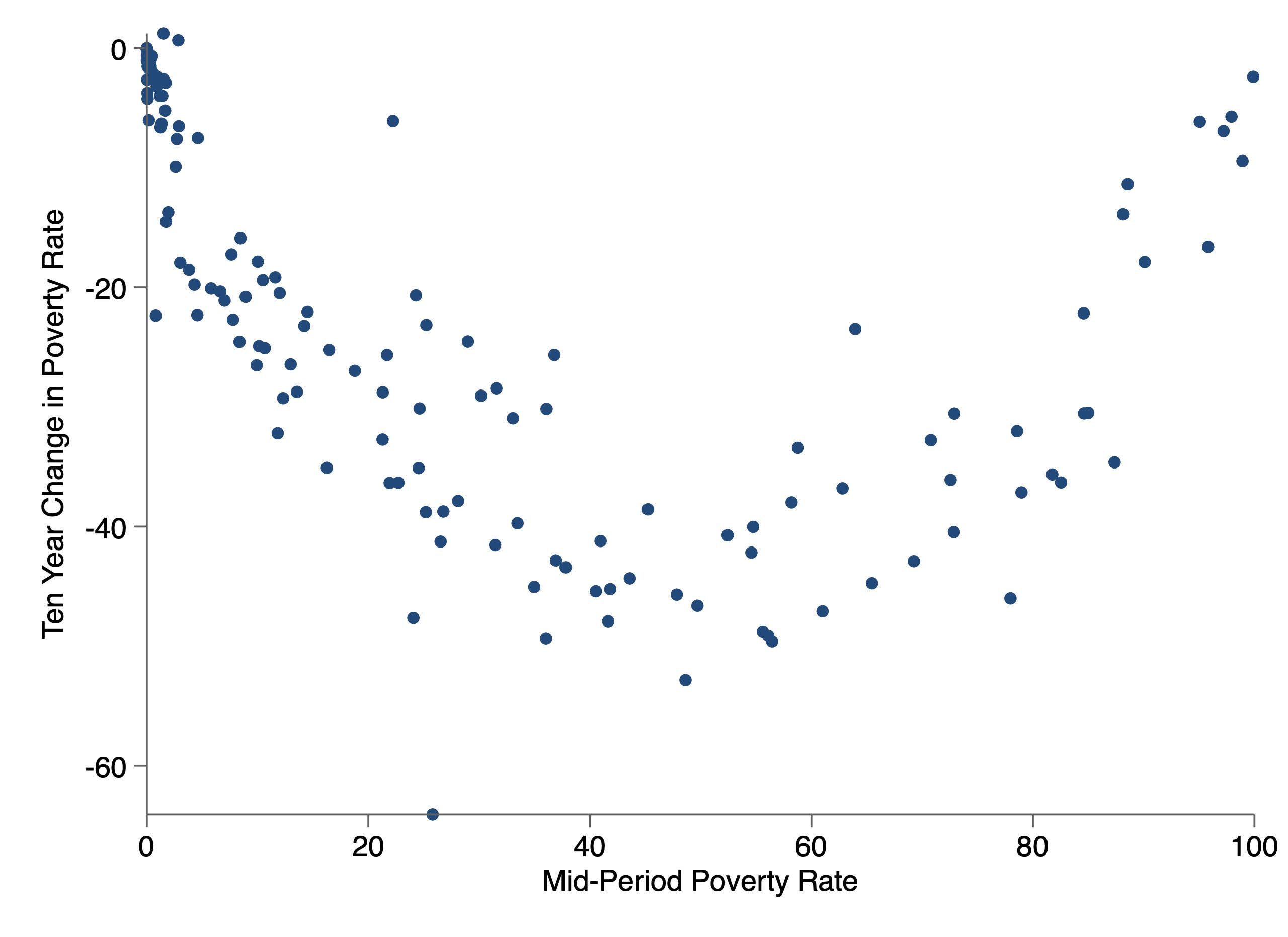
We see here the ten-year changes in the poverty rate for periods of (possibly overlapping) country growth of between 8 and 9 percent per year. For such fast-growing countries, the poverty reduction was fastest when the midperiod poverty rate was 50 percent. For countries with poverty rates around 10 or 90 percent, the pace of progress was roughly half.
In other words, for a fast-growing country, the transition from a high rate of poverty to a low rate of poverty may happen suddenly and with little change in the pace of overall economic growth.
In part, this is an artifact of how the data was constructed. We estimate the poverty rates assuming that per-capita household incomes are distributed lognormally — i.e., that the natural log of those incomes falls along an ordinary bell curve. This is a frequent assumption for incomes other than those at the very top. If per-capita household incomes are lognormal, then the Gini coefficient and mean household income alone suffice to describe the entire distribution. The poverty rate follows directly.
So why is 50 percent so important?
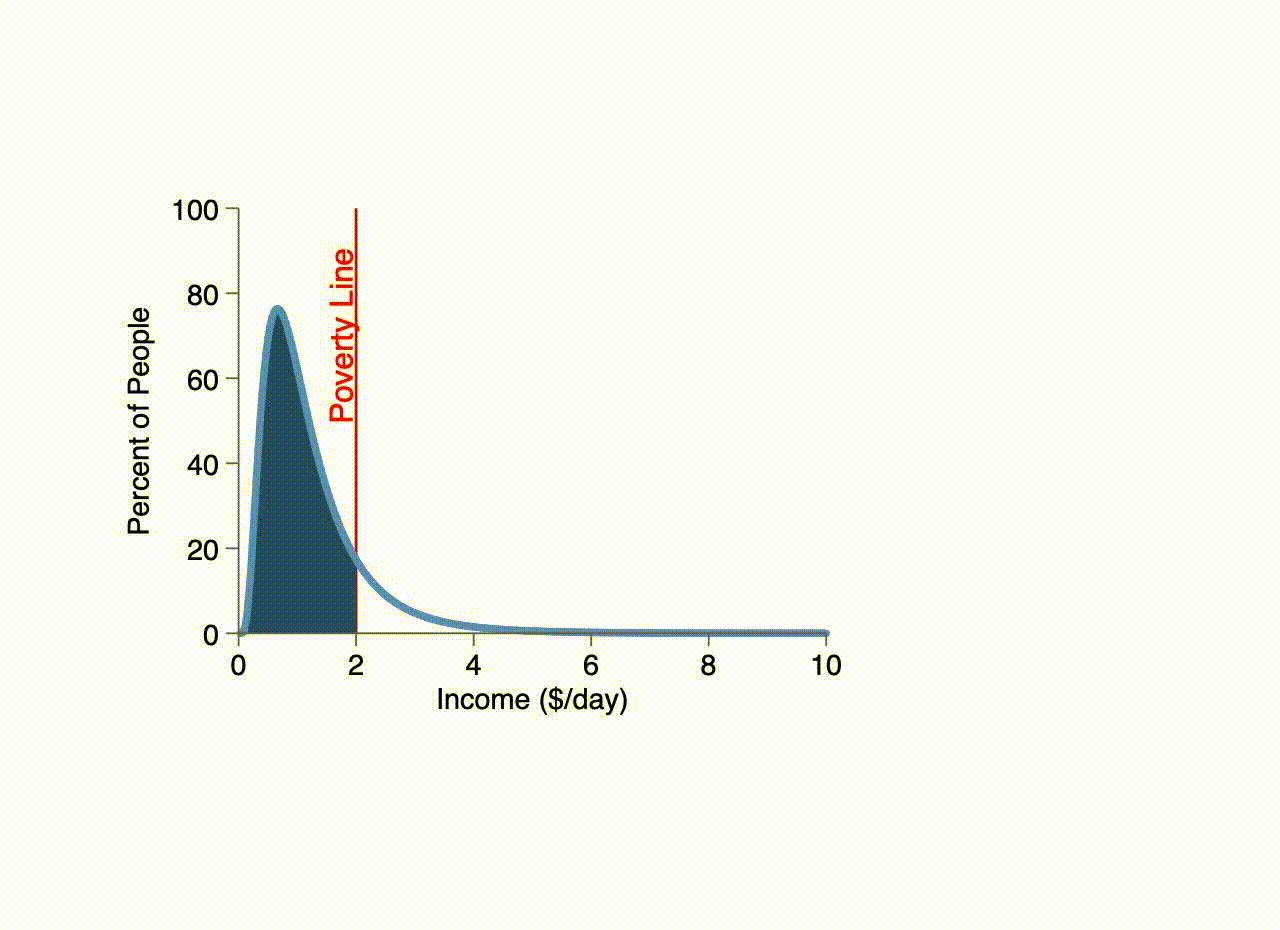
Suppose we are looking at a poor country with a million people and low inequality. It may be that about 60,000 people have daily incomes between $0.95 and $1.05 — effectively half the specified poverty line. (To simplify the math, we illustrate here with a $2.00 per day standard.)
Many fewer people may have daily incomes between $2.95 and $3.05.
And we can keep adding incomes until the pattern emerges

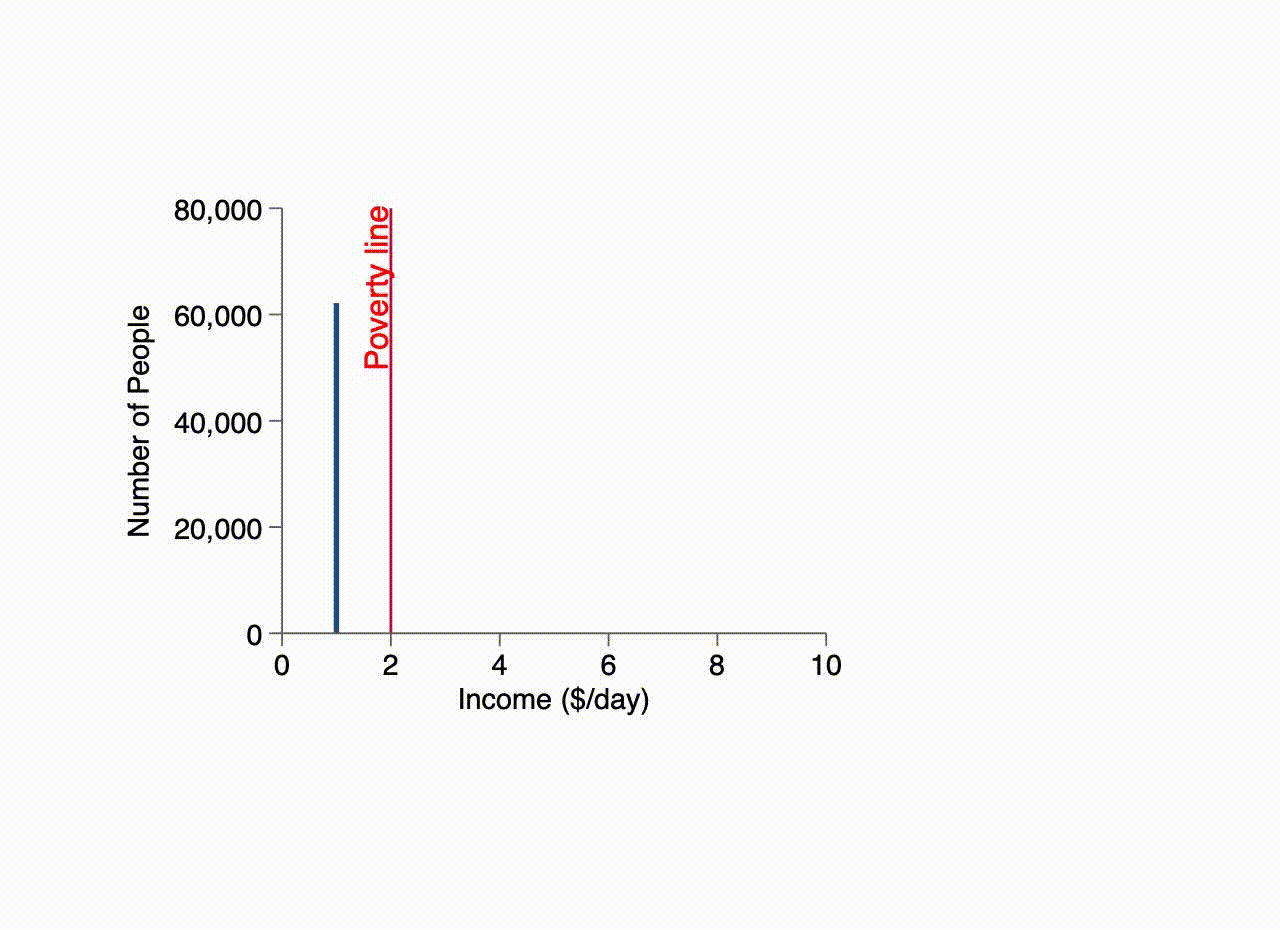
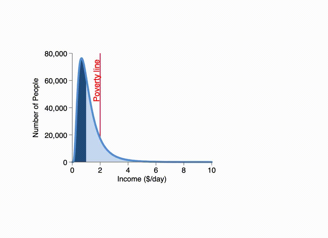
Now, we can fill the entire distribution with ten cent wide bars. Ten dark-blue bars represent people with incomes of $1.00 per day or less, and many more bars of light blue count those with higher incomes.
We see here that the average height of the ten dark-blue bars is 50,000 — meaning there are 500,000 people with incomes of not more than $1.00 per day.
Likewise, if we stack the light-blue bars into just ten (again, with a combined width of $1.00 per day) they clearly represent 500,000 people.
Thus, half of the one million people have incomes below $1.00 per day and half above — the median household income is exactly $1.00.
Similarly, all the people to the left of the red “poverty line” of $2.00 per day have incomes less than that. Thus, we see that 86 percent of all people are poor, versus 14 percent with incomes greater than $2.00 per day.
Note that we have rescaled the vertical axis so that the height is the percent of people represented by ten ten-cent-wide bars (or one dollar-wide bar) of that height. Thus, 1.7 percent of people (one-tenth of 17 percent) live with incomes between $1.95 and $2.05 per day — or within $0.05 per day of the poverty line. Likewise, 7.6 percent (one-tenth of 76 percent) of people have income within $0.05 of $0.66 per day.
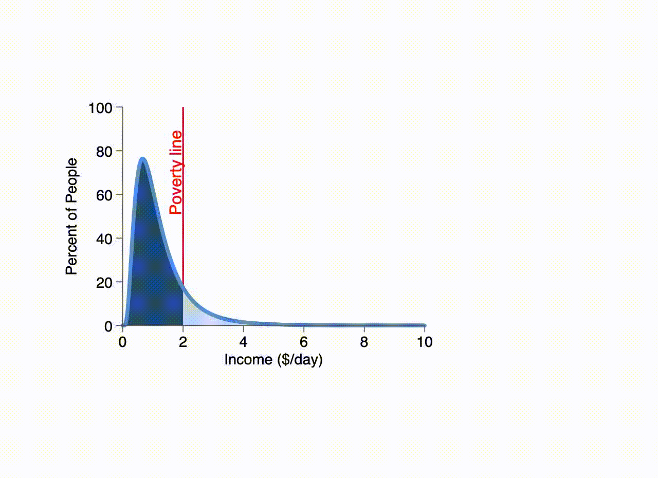
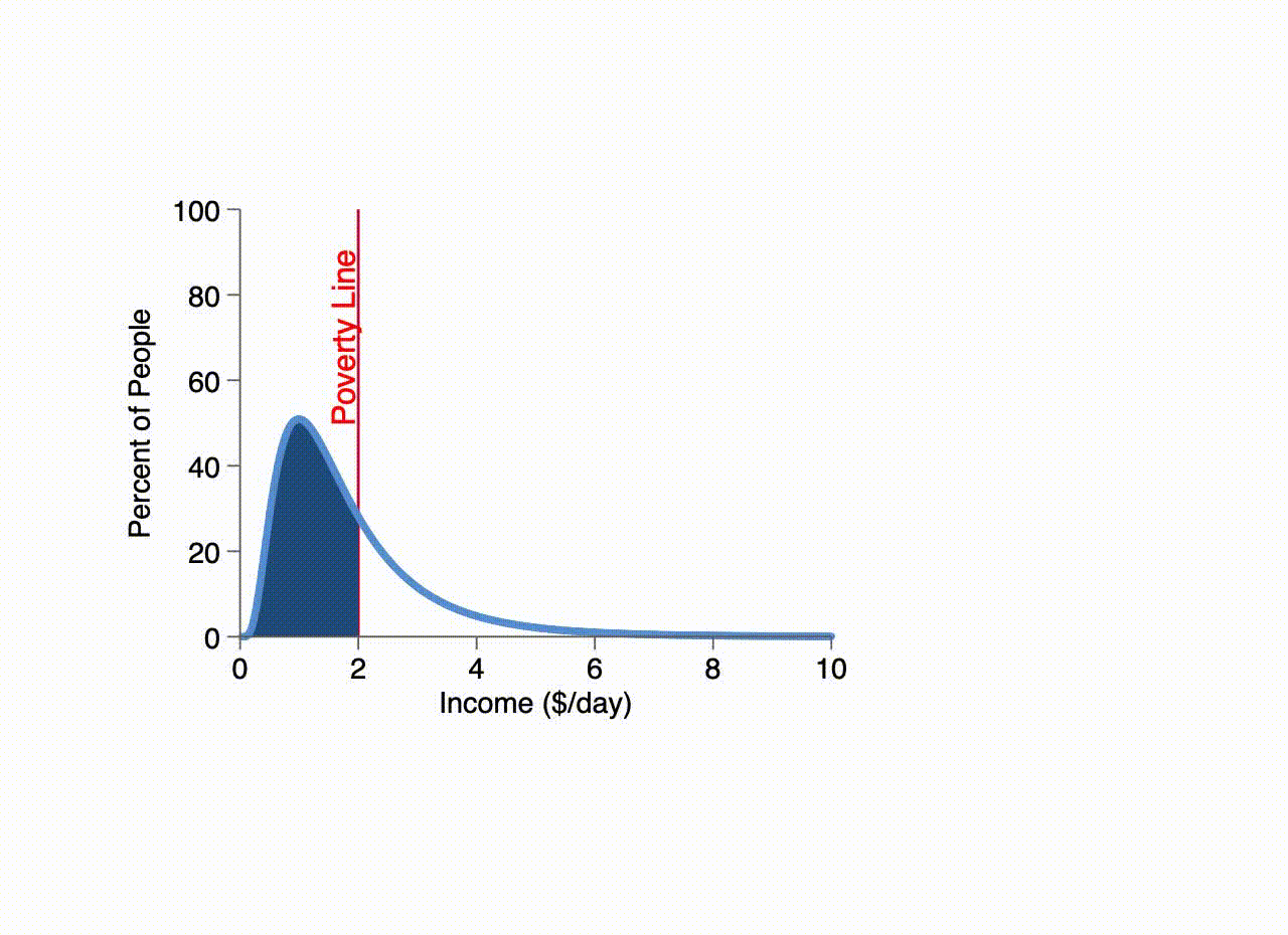
Now suppose the income of every person increases 50 percent, so those just at the poverty line find themselves with daily incomes of $3.00. Obviously, these people are no longer in poverty. Here we see the share of people that are drawn out of poverty when income rises by 50 percent.
Because the incomes of those just at the poverty line grew by exactly $1, our final dark blue bar is exactly $1.00 wide and its height therefore shows us that 19 percent of people are drawn out of poverty.

If incomes had grown only 5 percent, rather than 50 percent, we would have been left with a single ten-cent-wide bar of almost exactly the same height. With a bar only one-tenth as wide but nearly as tall, 1.8 percent of people would be drawn out of poverty by 5 percent growth.
In other words, the percent of people drawn out of poverty is well-approximated by just two factors: the height of the distribution curve at the poverty line, and the income growth of those at the poverty line.

By assuming all household incomes grew at the same rate, inequality (as measured by the Gini coefficient) was unchanged. However, as long as we are interested in those at the poverty line, it is the experienced income growth of those people which matters. Here we see growth of 5 percent at the poverty line (so those just barely poor again wind up with incomes of $1.10 per day).
However, inequality increases considerably over this time so that the poorest people actually lose income. Effectively, growth in incomes of those people at the poverty line matters for poverty reduction. Neither the growth of income of the very poorest nor that of the richest influence the poverty rate.
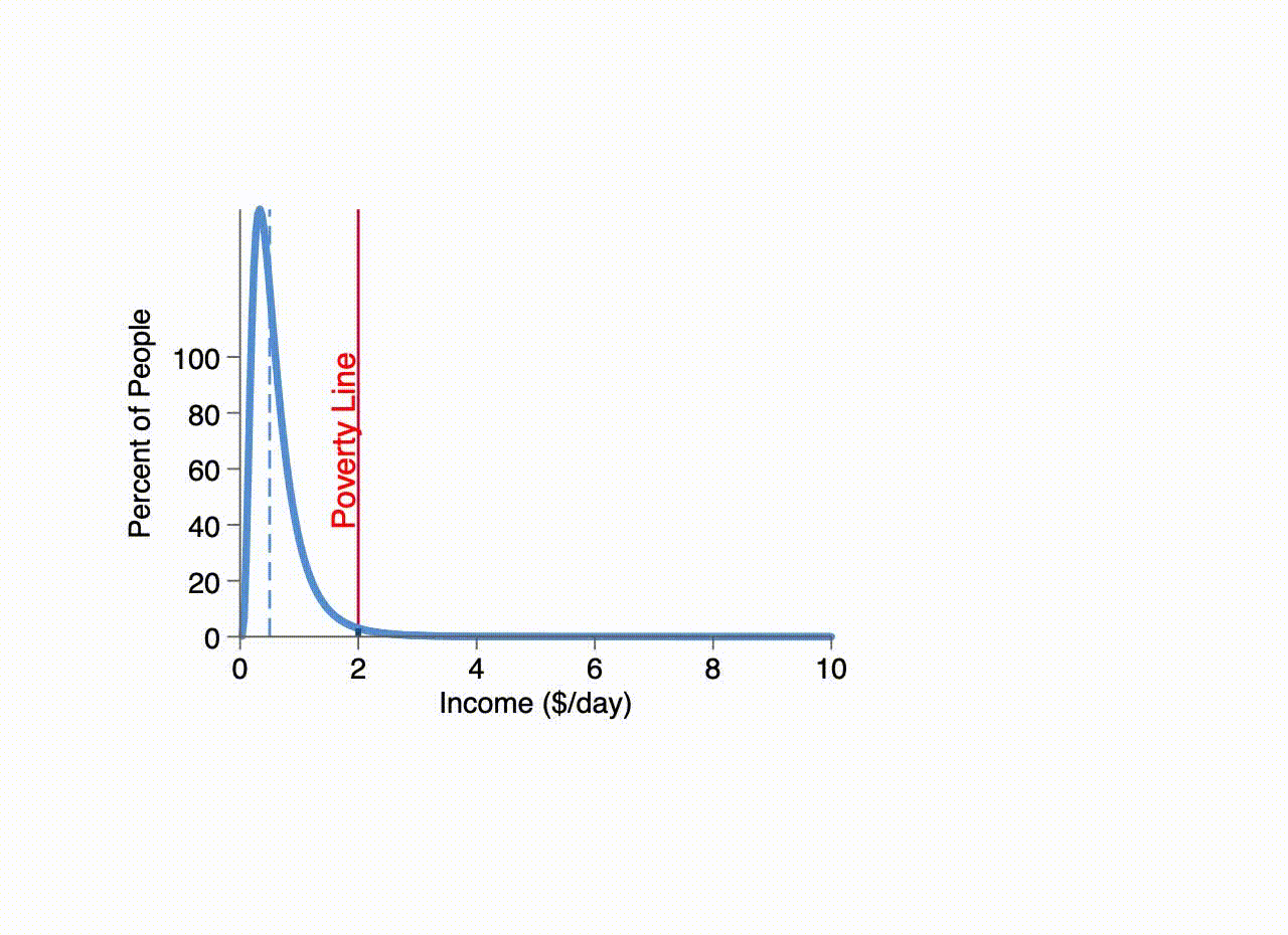
Finally, we have raised the initial income of all the people by 50 percent (so the median is $1.50 per day and the poverty rate is only 67 percent.) All incomes still grow another 5 percent, so those at the poverty line again wind up with incomes of $2.10. But there are initially many more people near the poverty line, so the same 5 percent income growth is more effective at reducing poverty than was 5 percent income growth when the country was poorer.
In fact, growth is most effective at reducing poverty when the median income is at the poverty line. As we see the economy grow — the dashed blue line showing the median income — the red curve traces the concentration of households at the poverty line for each median.
This explains the pattern we saw earlier. For a given rate of growth, that growth rate is most effective at reducing poverty when the median is at the poverty line. Neither extremely poor nor relatively rich countries have any hope of rapidly reducing their poverty rates — no matter how fast they grow.
To put it simply:
- Growth is most effective at reducing poverty when there are many people with incomes just below the poverty line
- If incomes are distributed lognormally, then people are most highly concentrated at the poverty line when the poverty rate is 50%
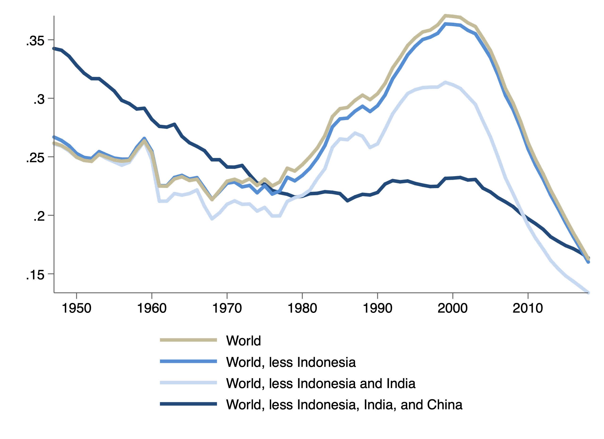
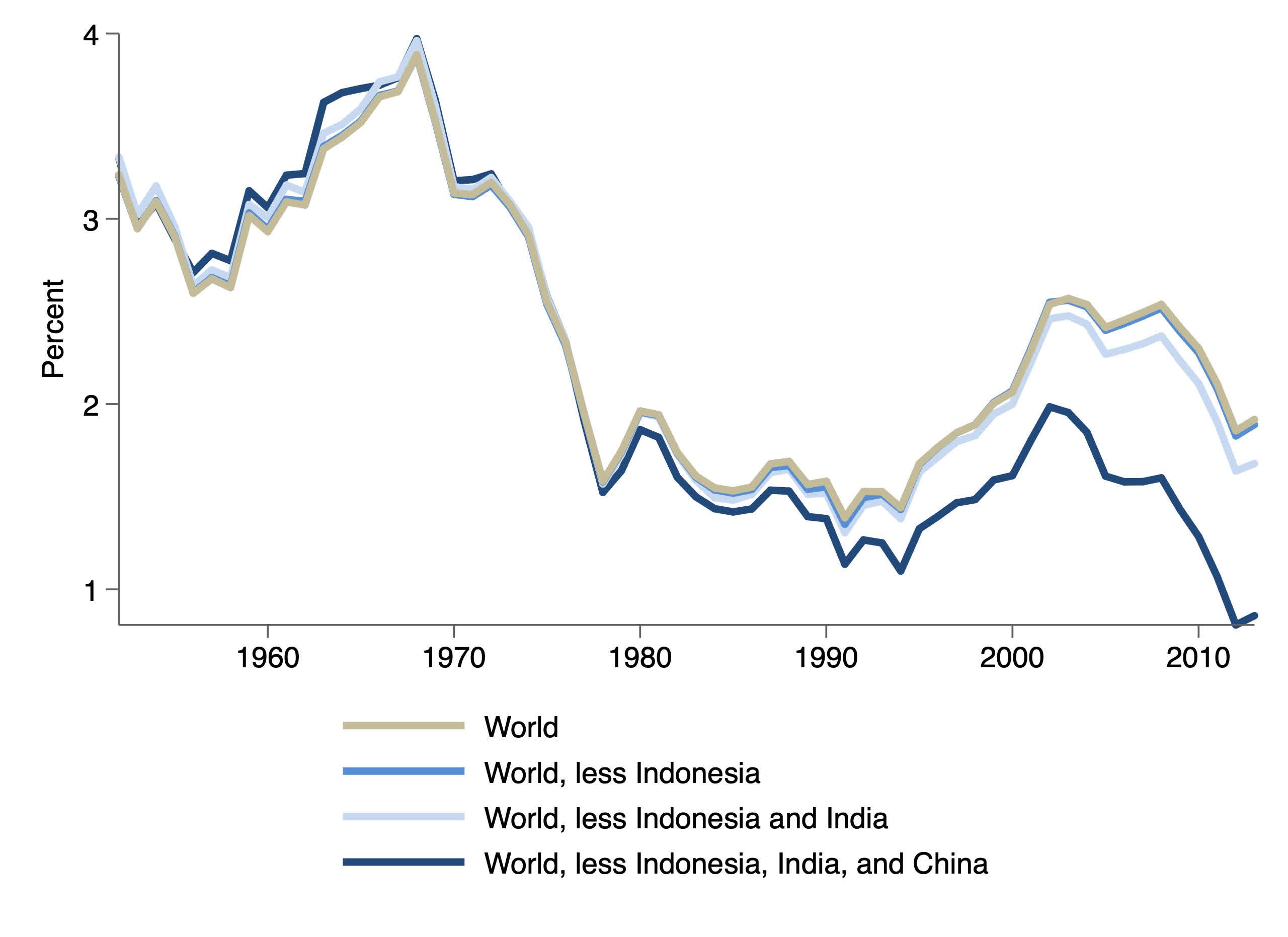
After a slow, decades-long decline, the concentration of the world’s population just at the poverty line rose steadily through the 1980s and 1990s and peaked in 1999. Therefore, growth was most effective at reducing the poverty rate at that particular time.
As it happens, between 1997 and 2006, China, India, Ethiopia, Myanmar, Uganda, and Nepal all had poverty rates that crossed below 50 percent. Nearly two-thirds of the world’s poor in 1997 lived in those six countries, and their poverty rates fell by half in only nine years.
Unsurprisingly, the bulk of the poor of these six countries — 93 percent — lived in China and India.
Removing Indonesia from the picture has no significant impact on this history. Removing India as well weakens the story somewhat. However, if we take China out of the picture, there is, through the rest of the world, a rather sustained long-run decline in concentration of incomes near the poverty line — though stagnant through the 1980s and 1990s.
With a lower concentration of poor elsewhere, sustaining reductions in the poverty rate outside of China and India required extraordinary rates of growth.

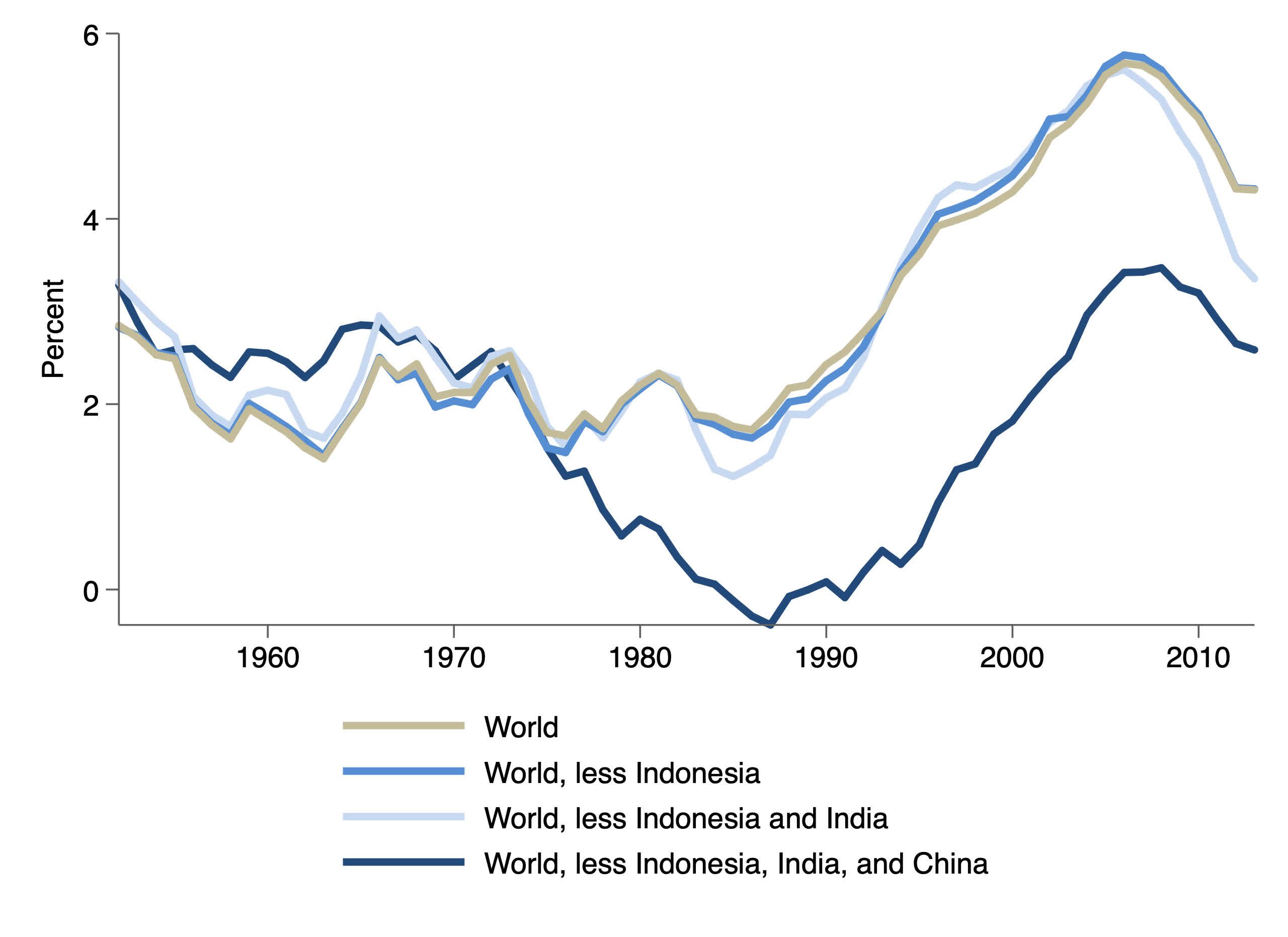
On the other hand, despite an acceleration around the millennium, income growth has generally slowed since the period following the Second World War. Growth in China, and later India, has compensated only somewhat for broadly slower growth in much of the world. We see here the annualized percent growth in a population-adjusted index of mean household income for the ten-year window centered on the specified year.
For example, the data points for 1990 shows annualized growth of about 1.5 percent (16 percent cumulative) from 1985 to 1995.
As we have seen, it is the growth in incomes at the poverty line that matters most. We see here the average growth in poverty-level incomes weighted by the density of population at the poverty line. World income growth for those at the poverty line would have been quite disappointing in the 1980s and 1990s but for faster growth in China — and to a lesser extent, and most recently, in India.
But for Chinese growth, progress in poverty reduction might well have stalled for a decade or two.
The fact that Chinese and Indian growth peaked just as they have represented a highly concentrated share of people just near the poverty line has meant that their growth — combined with their simply happening to have had large numbers of people near the poverty line — overwhelmingly explains the global trend.
If you appreciated this work, please consider a donation to support the Center for Economic and Policy Research.
David Rosnick is an Economist with the Center for Economic and Policy Research in Washington, DC.
Thanks to Dan Beeton and Rebecca Ray for their feedback.